Tuesday, September 21, 2010

Preliminary sketches for currency project.


Monday, September 20, 2010

Thoughts about Currency

While doing some research for this currency project, I came across an article about the Dollar ReDe$ign project/competition. In the article there were a couple of key points that have encompassed my thoughts and ideas for this project. The first being the idea that the Bills should be different sizes; (i.e. the $1 being the shortest and the $100 being the longest) This done to help the visually impaired differentiate between the different bill denominations. 
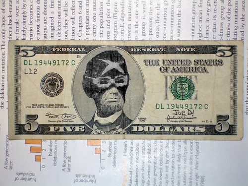
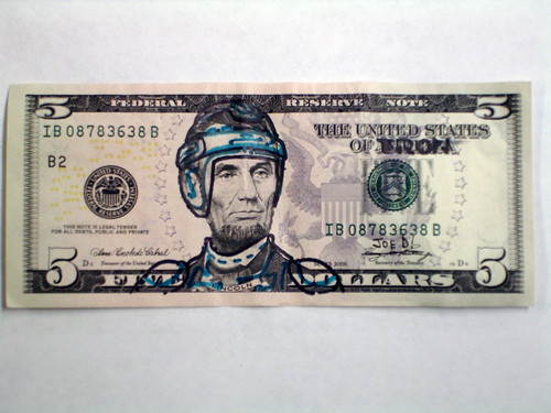
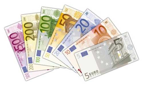
Dowling | Duncan use this with their submission for the Dollar ReDe$ign project. The other point is texture. Giving the different denominations a distinct texture or embossing would help differentiate the different bills. The last point that sticks out to me, is color. A varying color among the bills will A) help differentiate between different denominations,  B) make them less dull looking, and C) put America's currency in the same "playing field" as the rest of the worlds currencies. America is the ONLY country with that dingy green color for their banknotes.

Oh America, you please me soooo much.

I think this speaks to how americans waste money. Or maybe how the American dollar will stop being used, substituted in for toilet papier, and "the Amero" will take its place.


Way to be self-centered America, really. I mean, "Amero?" Way to not come up with something yourself, too.

Muahahahaha…more Glourious treasures!

These are just amusing. Not so much loaded with negativity, just humorous vandalism. Very amusing really.


The first one here, shows Abe Lincoln on the previous version of the 5 but as a super hero? or a luchador.

The second one, is of Abe Lincoln on the current version of the 5 but as an american football star? or maybe a wrestler? Football seems more fitting, since americans are heavily obsessed with it.

EDIT: The first one is Racer X Lincoln from Speed Racer, and the second one is TRON Lincoln.

I apologize for my mis-identifications. I'll try harder next time.

Ahaha. I LOL'd.

By no means of how i want to recreate my currency (but it was definitely a minor thought. ;P)


--Check it, "Socialist states of america"(?) and "The Messiah"(?) or better "I believe in sharing your wealth" right above a redesigned Federal reserves seal. Really have some negative minded people out there. Nonetheless, it made me lul.

Saturday, September 18, 2010

Currency project(?)


Look at this shit: 

-just fucking beautiful. 
this is the currency for Papau New Guinea;
The 2 Kina and 50 Kina feature images of their parliament building. The 100 Kina contains an image that represents their economy on one side (shown) the opposite has and image of the parliament building. The 10 and 5 Kina contain the Bird of Paradise (the country's National Emblem). The 20 Kina features the Head of a Boar (shown) and the National Emblem on the opposite side. 


AND THESE!! The Euro, has been evolving into the universal currency for Europe, this side of Germany. 

On a side note, I'm noticing that most banknotes in different countries are kept within the 6-7 note range. 

Friday, September 17, 2010

The colors, well…they might as well blend…

Using photoshop, and the mixed brush tool I "painted" these pictures. Again, the first set was done in class and the other set was an image of my choosing.

For the light may change…

These are the before and after images of editing the lighting of a picture. One done in class, and another of my choice.


Sunday, September 12, 2010

Bamboo Pen

This weekend I finally got my Bamboo© Pen tablet. ^_^ so excited. I plan on using it for EVERYTHING. It was a quaint $70, but very worth it. I know i'll use it a lot.

Wednesday, September 8, 2010

Wish you were here (well not really, thats why im gone.)

I had to create different postcards using the phrase "Wish you were here." I chose to spice up the "postcard" aspect by downloading sets of stamp brushes for Photoshop©.


I felt this second was very humorous; the background image is of a cemetery in New Orleans. The inserted image of myself is crappily inserted. The highlight didn't turn out as well as I would have liked.


The third image here, is my choice submission. Very similar to the first one; however, i used a different stamp brush, and layered the stamp. I used three separate colors to make up the stamp image. I feel it turned out really…cool? White, red, and black with different opacities to add depth and contrast to the stamp. Also notice that the inserted image of myself is in a different pose than the first.